Pheasants

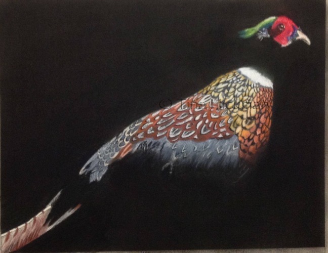
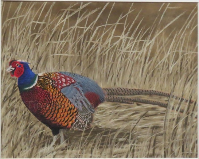
A few years ago, I decided to compete in the pheasant stamp design contest held annually by the Wisconsin Department of Natural Resources. The winner of the contest has their design made into a stamp which is sold to pheasant hunters. There are corresponding contests for turkey and duck stamps.

The first year I competed, I used a photo I had taken of a ringneck pheasant at the Oklahoma City zoo. It took fifth place! I got a certificate and everything!

91CDA495-DCE4-457B-AF4E-03C4D41731B4

That year, I took a photo of a taxidermy pheasant owned by the DNR. While I was photographing it, the camera did not adjust quickly enough to the strange lighting conditions, and I got quite a unique photograph! I decided to turn it into a drawing, which I submitted for the next contest. I did not expect to win because I have seen photographs of previous year’s winners, and my art does not look like those. In fact, part of the reason I submitted this drawing was to suggest to the judges that there exist other suitable styles! Surprisingly, I took second place and my piece was put on display for 10 days at the state fair!

It’s been a few years, but I have not yet drawn another pheasant. They are SO detailed!  Still, I have dreams of entering all three contests in the future!

Tin Lizzy

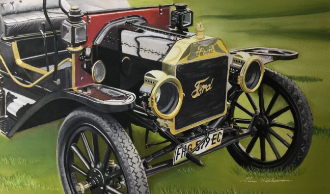
I have always liked antique cars. I finally decided to draw one. I had a photograph of a car that I had run across in a parking lot, and I figured that would be a great thing to draw. I wouldn’t even have to rely on someone else’s photo!

I was bored before I even finished the line drawing. As it turns out, I am only interested in a particular look, not antique cars in general. Although I liked the car, I did not love it. I ended up scouring the Internet anyway, looking for the right photo.

When I found this photo, I was very afraid of becoming bored again with the line drawing. For the second time ever, I actually asked myself, “what is most important?“ I decided that for me, the most important features of the car were the wooden wheels, the grill, and the lights. So I cropped the photo accordingly and got to work. The end result was one of my most technically impressive pieces. Probably also my favorite.

“Tin Lizzy”
1914 Model T
11 x 16″
Pastels on Pastelmat
Reference photo by Bob Adams

P.S. after I finished this piece, I joined a model T group on Facebook so that I could show it off. Imagine my surprise when the owner of the car, NOT Bob Adams, said that it was drawn from a photograph of his car! He did not show any interest in buying a print. 😕

The Handshake

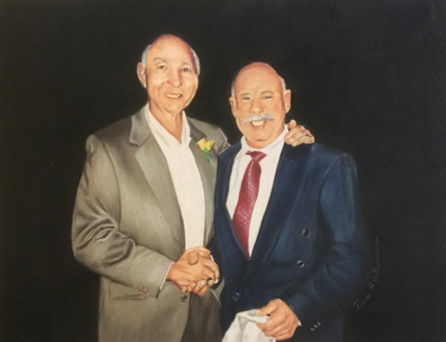
This was a commissioned piece, photo provided by the client. It also is smaller than I should probably work for this type of drawing… I cannot get the detail I’m accustomed to getting, and it is difficult for me to place things just so.

I have a mild form of prosopagnosia, which means I have a lot of trouble recognising people using only their faces. Prosopagnosiacs learn to recognise people by their hair, glasses, clothing, gait, voice, and other such clues. It is not that we cannot see eyes, nose, mouth, etc., simply that we cannot discern the subtle differences in each individual. It’s similar to you trying to you trying to identify one guppy in a school. You can see all the features, but all the guppies look the same! Unless one has some very distinctive feature.

So imagine how I felt when this commission came along and I wasn’t even sure which man was standing in front of me.

Luckily, my proso is mild. This means that I can learn faces given enough time / exposure. It also helped that one of the men is famous, so I was able to find photos online to help me learn his face.

In the end, it was a success. The commissioner was happy, I was happy, everyone was happy.

Challenging Myself

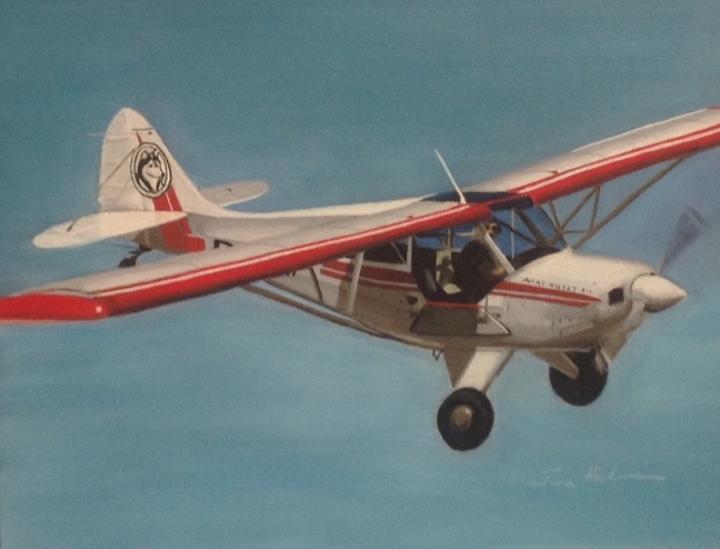
Today I will feature this airplane. After I got back into drawing, I decided that I would offer pet portraits for sale. I drew a lot of dogs and cats as well as the occasional guinea pig, lizard, rabbit, etc. to flesh out a portfolio. After I felt that I had enough pets to show, I started drawing wild life also.

Of course, the best way to keep artwork is to frame it, so had framed many pieces. I found a guy I like, so I kept bringing in my artwork. He was also an artist, and he gave me some valuable critique from time to time.

One day, he very nicely, very tactfully, very gently told me that all of my work looked the same. He suggested I step out of my comfort zone and challenge myself. He asked me what I least enjoy doing, so I told him foliage. I also told him in very strong terms that I was not going to draw foliage. I knew what he meant. He meant that all of my work was portraiture. Everything I drew was a head on a blurry background. An animal, a bird, a person. All of it was the same. Even before he said it, I had already been thinking that I was bored. I was bored because everything I was drawing was a head on a blurry background! So after some initial resistance, I took his advice.

He suggested that I draw a car. I told him that cars were boring, that I would not draw a car. So he suggested a building. I informed him that buildings are even more boring than cars, and I would not be drawing a building either! Finally I suggested an airplane. He said turn an airplane would be fine.

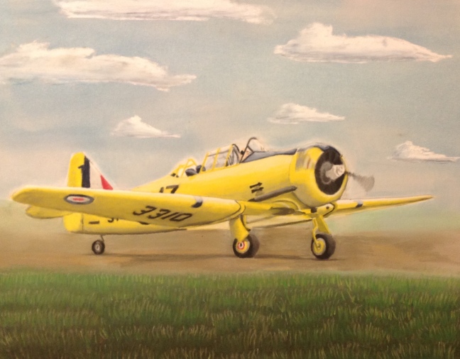
We decided that I would try drawing upside down. I understand the advantage of drawing upside down. However, it does not work for me. I can tell you that I felt that my work was greatly diminished because I actually missed details. Instead of seeing more, I saw less. In a way, drawing upside down did exactly what it was supposed to, it kept me from understanding the airplane and forced me to see a completely unfamiliar set of shapes. Unfortunately, this made it very difficult for me to pick out the details because I already could not see the main shape. It’s hard to explain, but on the red and white plane, I drew it the way that I am used to drawing. On the yellow plane, I drew upside down. I consider the yellow plane an inferior product.

D84401A1-DC01-41E6-8582-AEA263BE5332.jpeg

“Runup”
8 1/2 x 11″
Pastels on PastelMat
Reference photo by Pete Markham

What I found most fascinating about this project was that the airplane was no challenge at all! I found it far easier than drawing animals and birds! It turns out that I am better at smooth textures than I am at furry ones! So I drew the airplanes, and then I found a car I liked, and then a building I like. Then I did a still life because I had been wanting to draw reflective glass or metal. At the end of it, I learned that the car and the building and the airplanes and the still life were no trouble at all! It is the fur which is my biggest challenge other than foliage!

And my work still looked the same, because the planes and car and building and still life were still, at their cores, portraits.

Featured drawing:

Aviat Husky
8 1/2 x 11
Pastels on Pastelmat
Reference by Fernando Marinho Pereira

Variety is the Spice of Life

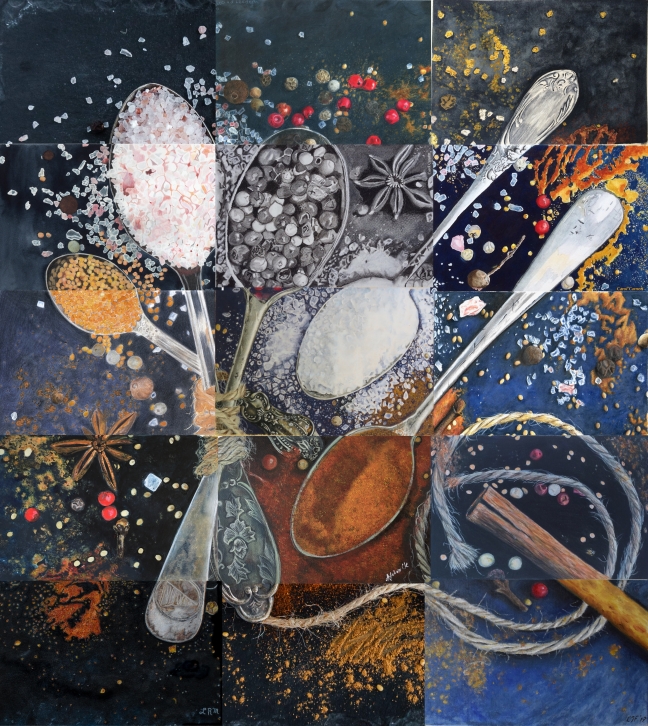
Okay, so something really exciting happened. As an artist, I am a member of several different art groups on Facebook. One day, a Dutch woman posted in one of them that she was interested in doing a collaborative art project with another artist, but didn’t have any details ironed out; was anyone interested? Well, the response was amazing! Well over a dozen artists responded! There were so many people, that at first she didn’t think she could ever accommodate them all. But then a solution presented itself. A few artists dropped out before it got rolling, leaving a total of 14 participants.

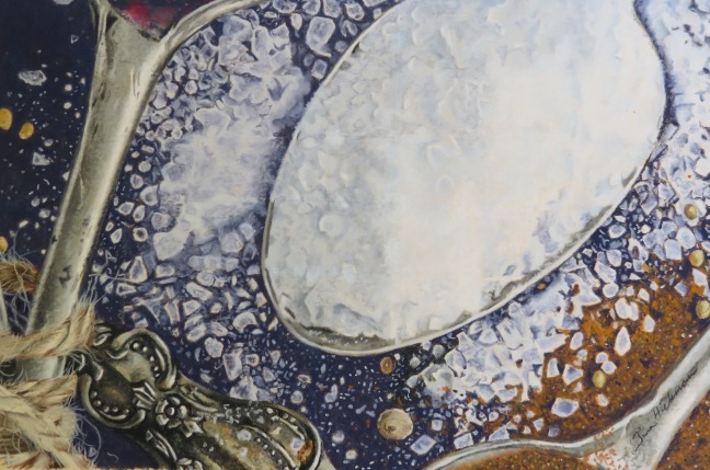
She ended up dividing a reference photo from Pixabay by Daria-Yakovleva into fifteen different pieces. Each person drew one section, the last section being the photograph itself. For a month, I painstakingly drew the most challenging piece I think I’ve ever done. February 19, I finished my piece! Above is the finished piece with everyone else’s portion photoshopped together to make the whole piece.  Below is my section.

IMG_2763

One of the most interesting aspects (to me) of the project is how diverse the group is! The fourteen different artists represent SEVEN different countries around the globe! We all worked together to prove that sometimes, a whole really is much greater than the sum of its parts. It was a very interesting project, and I learned a lot about how I might tackle scary textures in the future.

Participating in this project are me (Tina Hickman), Luca van der Leeden (our fearless organizer), Afshan Ck, Carol Carnett, Cass Hanley, Erik Franken (our Photoshopper, who assembled all the pieces!), Hanne Krumwiede, Holly Hoffman Farmer, Jennifer Swartout, Linda Prezalar Mello, and Victoria Diaz.  Unfortunately, three artists had to drop out due to personal issues and other priorities.

I present to you, “Variety is the Spice of Life.”

Rosé

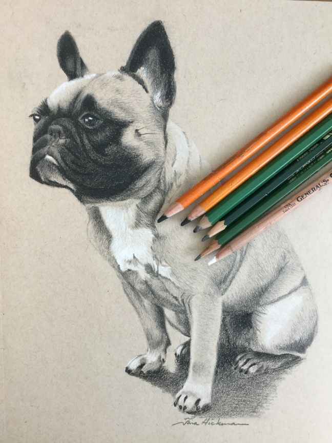
I’ve seen some work I’ve really liked done on toned tan or toned grey paper.  Basically, it’s just tan (or grey) paper designed for pencil work.  Many artists use graphite or charcoal on this paper to achieve a different look from the same drawing on white paper.  The most striking work I’ve seen has been charcoal and white charcoal (or perhaps black and white colored pencils) on toned tan.  When done right, it can really make a drawing pop!

Rosé is a French bulldog that comes into my grooming shop for baths, nail trims, and overnight boarding.  She’s a well-bred, sweet, energetic little ball of muscle, adorable as all get out!  I had photographed her one day in order to add something a little different to one of the Facebook groups that offers copyright free photos for artists’ use.  When I decided to experiment with toned tan paper, Rosé seemed like a perfect subject!

I’m not much for experimenting in my art, so logic says that I would only try one thing at a time and see how it turns out, right?  Well, apparently not.  Apparently I figured that if I’m trying out one new thing, I’ll just try a bunch at once!

So instead of using a grid with one-inch squares, I used three-inch squares, which requires much greater reliance on freehanding.  I used to freehand everything, so this was not a huge undertaking, but it is a significant diversion from my usual art the last four or five years.

And I may as well use a paper I’ve never used before.  That toned tan is awesome, right?  So I’ve seen a bunch of stuff done on it.  I know what I like.  I’ve seen the videos.  Let’s dive right in!

And charcoal.  Just because I haven’t really used charcoal before is no reason not to use it now, right?  But I didn’t like how it laid down on the paper, so I used graphite, too.  Apparently, you can’t mix charcoal and graphite, though it worked okay for me…

So in the end, I did not achieve the look I was going for, and I see some mistakes in the drawing, and I don’t like how the pencils laid down color on the paper, but I’m still pleased with the piece as a whole.  It was an interesting return to graphite, a medium I haven’t used in a few years.  For a pile of experiments, I’m quite pleased.  I am likely to try again to achieve the effect I’m looking for, perhaps with a different paper.  We’ll see what happens!

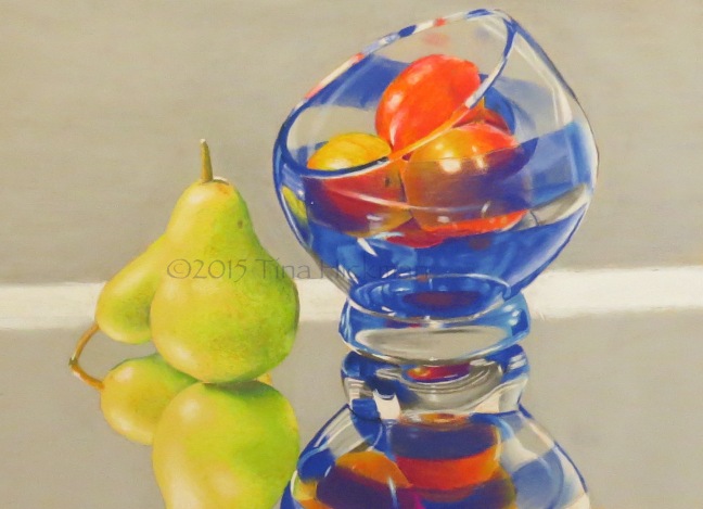
“Pears”

In January of 2015, I entered an art contest in the Facebook group Reference Photos for Artists – 2.  There are a number of free reference photo groups for artists, and some of them have weekly or monthly challenges.  In this particular group, they choose one photo, and all participants are to reproduce the photo in their own style with their own touches however they like in their preferred medium.  The winner got their drawing / painting featured as the cover photo for the group for the next month.

My framer had just gotten through telling me that my artwork was all starting to look the same, and I should challenge myself.  He suggested a number of things, none of which I wanted to do (all of which I ended up doing), including a still life.  I’d been wanting to try my hand at glass or metal, so when this challenge with a photo by Debbie Peaty came up, I decided to compete.  Hey, I wanted glass, and this certainly looked challenging!

No automatic alt text available.

Well, I spent four days on it, and in the end, I submitted a piece I was pretty proud of.  I lightened up the grey background because I just wanted to use the grey pastel stick I had on hand, and I greened up the pears because I just think pears are green.  I could see that they are yellow, but I wanted my pears green.  So I ended up with this:

PearsWatermarked

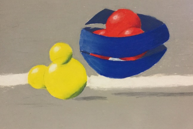
The above piece took first place in the contest and was featured as the group’s cover photo for the month of February.  I had enjoyed drawing glass, but the entire time I was drawing it, especially once I understood the true shape of the glass bowl, I kept seeing something different from what I had drawn.  Something intriguing.  Something I wondered whether anyone else saw.  It nagged at me, as I suppose art should, until finally I put it down on paper.  I didn’t spend nearly the time or energy putting it down on paper that I had spent on the “real” drawing, but I did this little abstract piece.  It’s the only abstract I’ve ever done.

IMG_2762

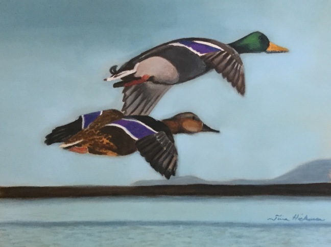
“Winging It”

I originally started this piece as a submission for the duck stamp contest for the  State of Wisconsin. I had submitted pieces for the pheasant stamp contest and took fifth place in 2014 and second place in 2015.   Wisconsin has stamp design contests for turkey, pheasant, and waterfowl. In an ideal world I would like to submit pieces for all the contests, but unfortunately that does not happen. Since ducks seem easier to draw than pheasants I thought I would give the ducks a try.

In one of the Facebook groups which provides copyright free reference photos for artists, I found the perfect photo of a pair of mallards winging their way over a large lake.   I laid out my line drawing on a piece of Pastelmat as I always do, anticipating that I would do the piece in pastels as I always have.   Somewhere along the way, I decided that I would take this opportunity to try out new the watercolor pencils that I had not yet really used.

Remember, I’ve never used watercolor pencils. I have seen tutorials, and I have been told several ways that one might use watercolor pencils. I even own a complete set of watercolor pencils. However I am often afraid to use a new type of paper or medium for the first time.  Usually  when I pick up my pencils, I intend to do a complete piece, not a practice piece, nor a practice subject.   So what possessed me to try to do a contest piece in a new medium on the wrong kind of paper?  Pastelmat  is great for pastels, but it’s not really designed with watercolors in mind.   Hence the name.

There are several ways that you can use watercolor pencils. First off, you can use them just like colored pencils. Why this would sound like a good idea to me, I have no idea, since I am frustrated by colored pencils and have never mastered them. The problem I have with colored pencils is that I do not get complete coverage,  and a lot of white paper shows through. This results in muted colors and an unfinished look. I have seen other artists use colored pencils very successfully to turn out photorealistic drawings.   They do not seem to have the problems listed above. I know they spend an astronomical amount of time building of layers and blending everything together. I have made modest attempts to do this but have never turned out a drawing that I was at all happy with using colored pencils.

Watercolor pencils can also be used the same way as watercolor paint.  One can make masses of color on the paper, like a sort of pallette, and pick up that color with a wet paint brush just like you might a tray of watercolor paint (you can do the same with just the pencils themselves, use a wet brush to pull the pigment directly from the pencil lead).    Just like regular watercolor paints, this gives a translucent thin layer of color.  This also is a silly idea for me, because I have not used watercolor paints in 30 years, and I had a limited mastery of it back then.   And it doesn’t give the kind of look that I prefer in my work.

So the previous two methods are ways to try to force the watercolor pencil to act like more traditional media.   Or, if you prefer, you can consider those to be ways that contribute to the versatility and diversity of the medium. But there are other ways to use them, too.   Really there is no wrong way to use art supplies, but some ways are better than others for achieving the effect that you wish to achieve.

My brilliant idea was to dip the pencils in water and draw with the wet leads  in order to achieve the kind of color saturation that I was used to.  Of course, the leads are water-soluble, so they start to melt a little bit when they get wet. This means that you cannot get a sharp point on your pencil,  at least not while it is wet. Not having a sharp pencil tip means that I cannot get the level of detail to which I have become accustomed.   Although I should’ve been able to layer more pencil over what I had already done, the base layer ended up so thick that the new pencil did not want to stick on the base layer.   In the end, I did finish the painting.   I tried to apply the base layer of the hen’s body in a traditional watercolor painting way, but the paper did not afford me the kind of control that I wanted. It ended up leaking outside the boundaries of the duck.  I used pastels for the background.

I learned a lot. I was reminded to choose the right kind of paper for the medium in question. I learned that the first time in a new medium may not be my own best work. I learned a way to not use watercolor pencils. I also learned that I very much do not like drawing Mallard hens.   It was a good learning experience and a meaningful foundation for future watercolor pencil work. I am still curious about the medium, and still interested in learning how to use watercolor pencils effectively.

But for this first experiment in watercolor pencils I was just “winging it”.
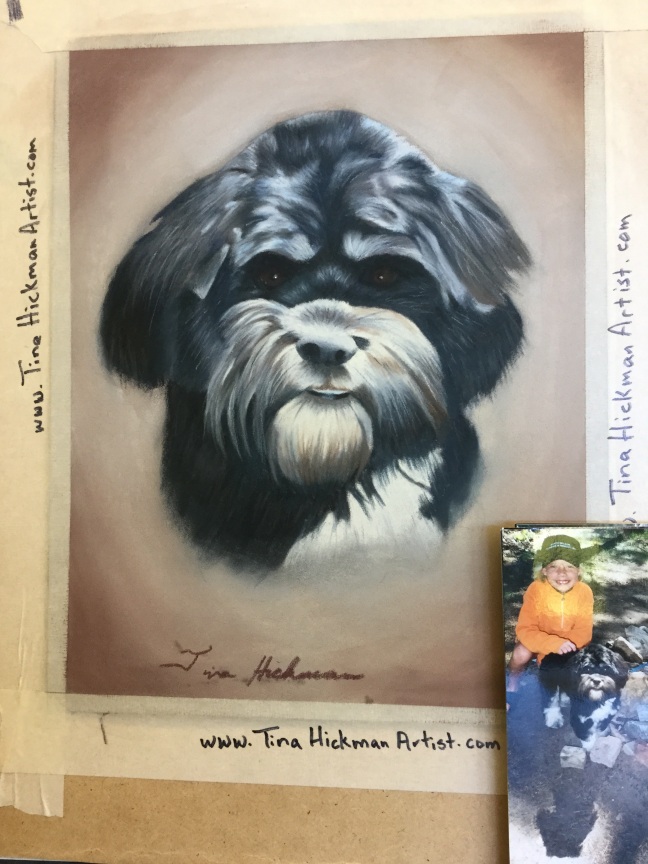
Luka

This Christmas I had the pleasure of drawing Luka. Sadly, Luka has passed on, but a friend wanted to gift his pet parents with a special portrait for Christmas. Because it was to be a surprise, she had to rely on her own reference photos, and there were only four of them in total. None of them was in crisp focus nor very large, but we settled on one that worked.

I strive to make my drawings at least as good as the original photo, and hopefully a little better. Often, the only change I make is to replace a cluttered, distracting background with a soft wash of color that is meant to complement the subject of the drawing, but my goal is to go further than that. I want to be able to add a little detail or color and make the artwork a real improvement over the camera’s work.

This time, I focused on enlarging Luka’s face and chest to give a better feel for him as an individual. I tried to change the perceived angle from which the photo was taken, so it would look as if it was taken straight on, rather than from above. To accomplish this, I cut out the legs and body and showcased just the head and chest. Since Luka was looking directly at the camera, I was able to accomplish this goal.

In the end, I took a small, fuzzy snapshot and blew it up into a good likeness of Luka. Because the reference came from the client (friend), it would be a fresh view they hadn’t seen before, something entirely new and unexpected. I’m excitedly waiting to hear how they liked it!

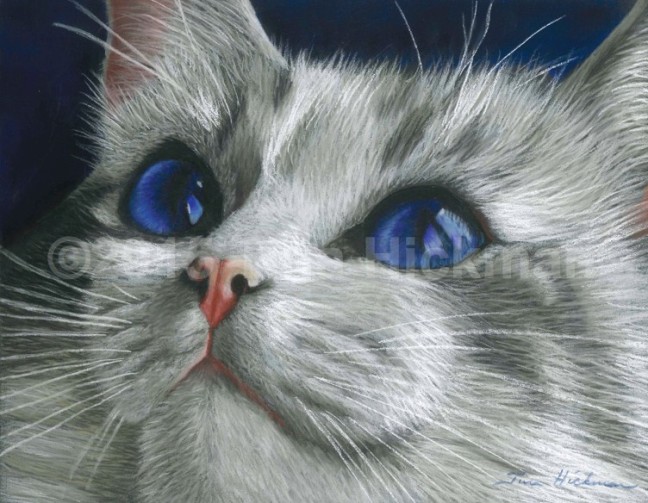
Spotlight — “Snowdrop”

Ahhh, the beautiful Snowdrop.  I ought to just rename the drawing, “The Beautiful Snowdrop”, for that is how I think of it.

Snowdrop is a purebred ragdoll cat owned by Louise Marie Stevenson in Britain.  Before I drew that piece, I hadn’t drawn a cat for a while, and I was thinking it was about time I did.  I knew just what I wanted…  a white cat looking up and into the distance, 3/4 view, big eyes with reflections for me to draw.  I searched through the photos in all the copyright free photo groups I belong to, but nothing was what I wanted.  I found white cats, but nothing that particularly struck me.  I may have found cats in the pose I wanted, but if I did, they didn’t capture my attention, because I was on a mission to draw a white cat.  So week after week, for two or four months, I drew other things.

One of the Facebook groups I belong to is called “Artists and Cats”.  It’s a group for cat lovers to post cat photos or art to share with other cat lovers.  It was started by a Facebook friend of mine, Carol Foerster, and I enjoyed looking at the photos people would post.  Imagine my surprise when someone posted a photo exactly as I had pictured it, along with PERMISSION for any artists who cared to draw or paint it!!!  I couldn’t believe my luck!

Of course, I got right on that.  But when I was faced with the prospect of actually drawing, I realized I didn’t want to draw it.  Even though it was the perfect photo, I found I was bored with half of it before I even started.  The more I contemplated drawing it, the more I inwardly groaned at the concept.  But it was the perfect photo for what I wanted.  What was the problem?  It was then that I asked myself a question I’d never asked myself before.

“What is important?”

The photo was of only the front half  of the cat.  It included her head, chest, and one front leg stretched out in front of her.  I realized I didn’t care about her chest or leg.  I wanted the whole cat or, really, just the head.  So I began cropping.  By the time I was done, I found that Snowdrop had lost the top of one ear and the majority of the other.  Even her chin was cut off a bit.  For perhaps the first time in my adult life, I seriously cropped a photo before drawing it.  I zoomed in on the features which had attracted me to the photo in the first place.  I’m sure this is something most artists do all the time, but I have always been a slave to the photograph, reproducing it  as faithfully as I could (except perhaps for simplifying backgrounds).

Snowdrop’s eyes really are blue.  I realized they needed to be toned down a little, and I tried, but my pencils really wanted her eyes to be the deep blue they ended up being on my paper.  So I gave up when I realized I just kept making them bluer again.  So when people ask, “Are her eyes really that blue?” the answer is, “Not quite, but in my mind they are.”  Also, I see I focused on the one part of her body with the most non-white color.  Oh well.  The point was, she appeared at a time when I needed her, and she was perfect for my needs.  To this day, of all my drawings, Snowdrop gets the most attention.

The photograph got a lot of attention when it was posted.  I saw two other versions of it that other artists had painted.  Maybe I’m biased, but I like mine best.  😉

Prints are available for purchase.